LogoLogo
OS Docs HomeOS NGDOS APIsOS Download ProductsMore than MapsContact Us
  • More than Maps
  • Geographic Data Visualisation
    • Guide to cartography
      • Introduction to cartography
      • Types of maps
      • Symbology
      • Colour
      • Text on maps
      • Generalisation
      • Coordinate reference systems
      • Projections
      • Scale
      • Map legends
      • Map layout
      • Relief representation
      • North arrows
    • Guide to data visualisation
      • Introduction to data visualisation
      • GeoDataViz design principles
      • Types of visualisation
      • Thematic mapping techniques
      • Data visualisation critique
      • Accessible data visualisation
      • Ethical data visualisation
      • Software
      • Data
    • GeoDataViz assets
      • GeoDataViz basemaps
      • Stylesheets
      • GeoDataViz virtual gallery
      • Equal area cartograms
      • How did I make that?
        • Apollo 11 Landing
        • North York Moors National Park, 70 years
        • Snowdonia National Park, 70 years
        • Great Britain's National Parks
        • Great Britain's Islands
        • Great Britain's AONB's and National Scenic Areas
        • Famous shipwrecks of Pembrokeshire
        • Trig pillars today
        • Britain's most complex motorway junctions
      • #30DayMapChallenge
  • Data in Action
    • Examples
  • Demonstrators
    • 🆕Product Viewer
    • Addressing & location demonstrators
      • Address Portfolio overview
      • Which address product should you use?
      • AddressBase
      • AddressBase Core
      • AddressBase Plus
      • AddressBase Premium
      • Address Classifications
      • Addressing Lifecycle
      • OS Emergency Services Gazetteer
      • What are Vertical Streets?
      • Why are there differences in boundaries?
    • Contextual demonstrators
    • Customer best practice
      • Channel Shift
      • Data Management and OS Data Hub
      • End User Licence vs Contractor Licence
      • 🆕 IDs vs Spatial Relationships
      • Why we should capture good quality addresses at source
      • Why we Snap and Trace
    • Network Demonstrators
      • OS Detailed Path Network
      • OS Multi Modal Routing Network
        • OS Multi Modal Routing Network
      • Water Networks overview
      • OS MasterMap Highways Network and OS NGD Speeds
      • OS MasterMap® Highways Network and OS Open Roads™
    • OS MasterMap Generation APIs
      • Using the OS Features API
      • Using the OS Features API Archive
      • Using the OS Downloads API
      • Using OS APIs in ESRI Software
    • 🆕OS NGD (National Geographic Database)
      • OS NGD Address
      • OS NGD Boundaries
      • 🆕OS NGD Buildings
        • 🆕Building and Building Access Feature Types
        • Building Part and Building Line Feature Types
      • 🆕OS NGD Geographical Names
      • OS NGD Land
      • OS NGD Land Cover enhancements
      • 🆕OS NGD Land Use
      • OS NGD Land Use enhancements
      • 🆕OS NGD Structures
        • 🆕OS NGD Structures
        • Field Boundaries
      • 🆕OS NGD Transport Features
      • 🆕OS NGD Transport Network
      • OS NGD Transport RAMI
      • OS NGD Water Features
      • OS NGD Water Network
      • OS NGD API - Features
      • Ordering OS NGD data
      • Change only updates
      • OS NGD Versioning
      • Creating a topographic map from OS NGD Data
      • Analytical styling for OS NGD data
    • OS MasterMap® demonstrators
    • 🆕Product & API Comparisons
      • 🆕Comparison of Water Network Products
  • Tutorials
    • GeoDataViz
      • Thematic Mapping Techniques
      • Downloading and using data from the OS Data Hub
      • How to download and use OS stylesheets
      • How to use the OS Maps API
      • Creating a bespoke style in Maputnik
    • GIS
      • Analysing pavement widths
      • Basic routing with OS Open Data and QGIS
      • Walktime analysis using OS Multi-modal Routing Network and QGIS
      • Creating 3D Symbols for GIS Applications
      • Constructing a Single Line Address using a Geographic Address
      • Creating a Digital Terrain Model (DTM)
      • Visualising a road gradient using a Digital Terrain Model
      • Visualising a road gradient using OSMM Highways
    • 🆕APIs
      • 🆕Using OS APIs with EPC API
      • 🆕OS APIs and ArcGIS
  • Deep Dive
    • Introduction to address matching
    • Guide to routing for the Public Sector
      • Part 1: Guide to routing
      • Part 2: Routing software and data options
      • Part 3: Building a routable network
    • Unlocking the Power of Geospatial Data
    • Using Blender for Geospatial Projects
    • A Guide to Coordinate Systems in Great Britain
      • Myths about coordinate systems
      • The shape of the Earth
      • What is position?
        • Types of coordinates
        • We need a datum
        • Position summary
      • Modern GNSS coordinate systems
        • Realising WGS84 with a TRF
        • The WGS84 broadcast TRF
        • The International Terrestrial Reference Frame (ITRF)
        • The International GNSS Service (IGS)
        • European Terrestrial Reference System 1989 (ETRS89)
      • Ordnance Survey coordinate systems
        • ETRS89 realised through OS Net
        • National Grid and the OSGB36 TRF
        • Ordnance Datum Newlyn
        • The future of British mapping coordinate systems
        • The future of British mapping coordinate systems
      • From one coordinate system to another: geodetic transformations
        • What is a geodetic transformation?
        • Helmert datum transformations
        • National Grid Transformation OSTN15 (ETRS89–OSGB36)
        • National Geoid Model OSGM15 (ETRS89-Orthometric height)
        • ETRS89 to and from ITRS
        • Approximate WGS84 to OSGB36/ODN transformation
        • Transformation between OS Net v2001 and v2009 realisations
      • Transverse Mercator map projections
        • The National Grid reference convention
      • Datum, ellipsoid and projection information
      • Converting between 3D Cartesian and ellipsoidal latitude, longitude and height coordinates
      • Converting between grid eastings and northings and ellipsoidal latitude and longitude
      • Helmert transformation worked example
      • Further information
  • Code
    • Ordnance Survey APIs
    • Mapping
    • Routing with pgRouting
      • Getting started with OS MasterMap Highways and pgRouting
      • Getting started with OS MasterMap Highways Network - Paths and pgRouting
      • Getting started with OS NGD Transport Theme and pgRouting
      • Getting started with OS NGD Transport Path features and pgRouting
  • RESOURCES
    • 🆕Data Visualisation External Resources
Powered by GitBook

Website

  • Ordnance Survey

Data

  • OS Data Hub
On this page
  • Step 1: 2D Contours
  • Step 2: 3D Contours
  • Summary

Was this helpful?

  1. Geographic Data Visualisation
  2. GeoDataViz assets
  3. How did I make that?

Snowdonia National Park, 70 years

PreviousNorth York Moors National Park, 70 yearsNextGreat Britain's National Parks

Last updated 1 year ago

Was this helpful?

This year we are celebrating 70 years of some of our amazing National Parks and to help mark this milestone, Ordnance Survey has been visualising these beautiful places using a variety of different techniques. The inspiration for this map came from an that focused on using contours and I liked the idea of visualising Snowdonia National Park in a similar way as it would accentuate the amazing natural features that make up the park (lakes, valleys and peaks).

All of the data used for the map is open and comes from as it contains a number of useful layers such as contours, national parks, names, surface water, and water lines. I downloaded the dataset in a GeoPackage format from the , and also obtained a copy of themes from the to help with styling. It can be accessed via the page.

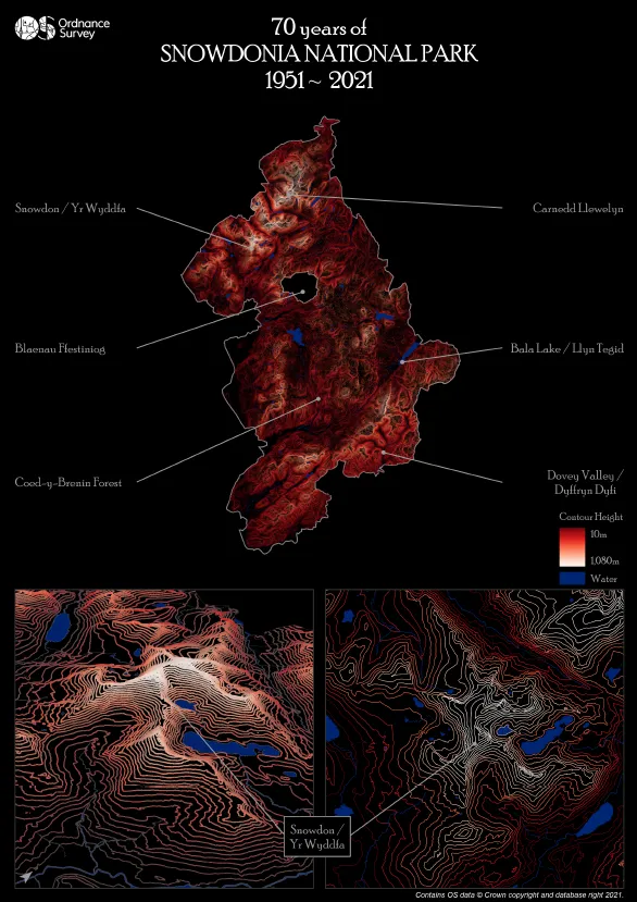
Final composition of the Snowdonia National Park data visualisation

Step 1: 2D Contours

The main focal point, Snowdonia National Park, was filtered from the National Parks layer, with the boundary then used to clip the contour, water and name features.

The contour layer contains features that are attributed as either ‘index’ or ‘normal’ – the normal contours being 10m, 20m, 30m etc. with the index contours being 50m, 100m, 150m etc. Each element on the final output contains a mixture of these features:

  • Snowdonia National Park = all index and normal contours

  • Snowdon 2D: index contours only

  • Snowdon 3D: a selection of normal and index contours

The line thickness of the contours was also experimented with, and I particularly liked the ‘sketch’ like feel using the smallest width possible (0.1) when viewed at the national park level. Colour also plays a major part with the visualisation, and I found most schemes worked well in creating dynamic lines that popped out from the dark background. However, the colour most associated with Wales was chosen for the final map…red!

Next up were the water features, and I played about with how much information was on display in regards to the ‘local’ and ‘regional’ settings in each layer, deciding on local surface water and regional water lines. I felt this helped to explain the dark areas of the map that contained limited or no contour lines, which would be the valleys, rivers and lakes.

Step 2: 3D Contours

As mentioned at the start, the inspiration for the map came from Wes Jones’ Esri blog post and I wanted to see if I could include a 3D contour map in a similar style. My original design was to create a 3D contour map of the whole national park, but it was clear early on that the technique leant itself to more detailed areas – hence focusing on Snowdon. One of the early drafts that I particularly liked when testing the process involved a small tile of contours, sitting on top of an OS Open Zoomstack night theme basemap. The contours were blended from the same colour as the water features, rising to the white peaks. As much as I liked this effect, I wanted to keep the same minimalistic style and colour consistency with the other elements on the map, hence why it was not included in the final output.

Getting the contours right for the 3D element required a little manipulation. Index contours were too limited with the 50m intervals whilst the normal contours were too detailed at every 10m. I therefore queried the dataset to include every 20m over 1,000m (1,000m,1,020m, 1,040m, 1,060m, 1,080m), then every 30m down to 490m and then every 40m down to 10m. If you have read Wes’ blog, then you will understand what the following settings relate to visualising the contours:

  • Transparency: High = 0%, Low = 70%

  • Colour: Reds Continuous (flipped)

  • Size: Min = 1pt, Max =1.5pt

One affect that I would have liked to of included would be to have the water features as 3D (e.g. a tube), and dropping between each contour like waterfalls. However, my graphics card was not overly happy with this idea and I couldn’t render the desired effect without my laptop crashing!

Summary

Once I had all the individual elements of the map decided, it was then a case of setting up the final template. As an admirer of Kenneth Field's cartographic advice, I asked for feedback from my colleagues on the map. I was really pleased I did as changes to certain aspects of the map have certainly improved the final output. And as always, maps are about personal preferences – I wanted the map style to look minimalistic, but that is not stopping others from creating something similar but using more features or labels. As already mentioned, all the data is open and free to use, so go download a copy and make a map of your favourite area.

Contour example: Index contours = 50m, 100m, 150m and 200m. Normal contours = 10m, 20m, 30m
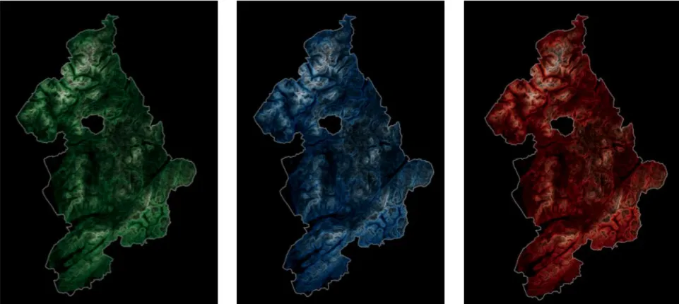
Experimenting with colour
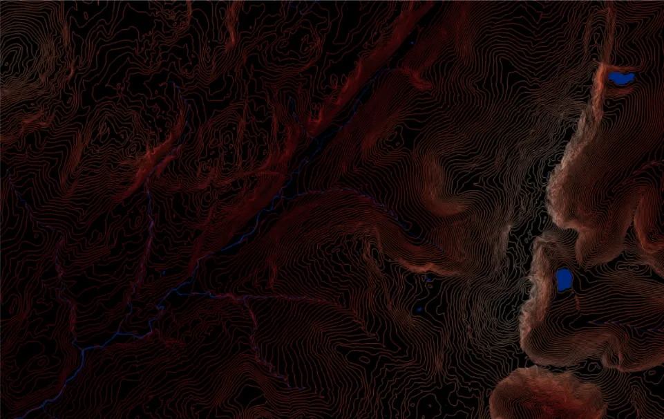
Example of rivers, valleys and lakes, in between the contours
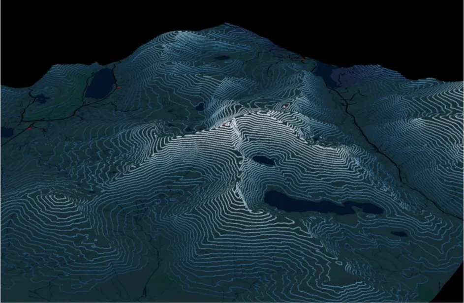
Test phase of 3D contours
Esri UK blog
OS Open Zoomstack
OS Data Hub
OS GitHub site
OS Flickr