Introduction to cartography
Last updated
Last updated
Website
Ordnance SurveyData
OS Data HubCartography is often described as the art, science and technology of map making; however, this definition varies depending on where you read about it or who you speak to.
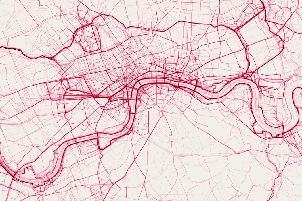
So, cartographers make maps… but what is a map? This has been widely debated and has arguably evolved over time. We’ve included a few ‘maps’ below. What do you think? Are they maps, are they charts/diagrams, are they art – or are they something entirely different?
At Ordnance Survey (OS), we view maps as a graphical or symbolised representation of the world around us and are a form of data visualisation – specifically, geographic data visualisation. That is, they are designed to communicate information which has a spatial (geographical) aspect to a user. So what is Spatial/Geographic data? It is any data which has a location associated with it. This could be the location of real-world objects or events/phenomena which happen at a location (or move between locations). Maps are a common way of visualising this geographic data – showing how real-world features relate spatially to one another, showing the location of something or showing how a phenomena varies in space (and sometimes time).
The form a map takes however will depend on what message you are trying to communicate, how the map is going to be used (the user requirements) and by whom. For example, the map you’d create for an avid hillwalker navigating complex mountain terrain would be very different from a map used to show the split of votes across a country after an election, or the migratory route of birds between continents. A cartographer is therefore responsible for understanding the use case, selecting the right data for the task, deciding what to show or exclude, and then presenting it in a way that is understandable and useful. It is trickier than you’d think.
With vast quantities of geographical data available online and a wide variety of mapping tools, it is so easy to create a ‘map’. But what makes a good map? Discover more about the art, science and technology of cartography, including tips and tricks for making a good map, in this OS Guide to Cartography. A lot of the principles we discuss relating to the use of text and colour on maps and map layout can be applied to any data visualisation, and we expand on different aspects of data visualisation in our OS guide to data visualisation.
The key to any map or data visualisation is that it is legible and understandable by the user and that it is designed with the user in mind. A good data visualisation (or map) will meet the needs of the user, communicating the message it was designed to give effectively and can be used and understood with ease.