Types of visualisation
Last updated
Last updated
Website
Ordnance SurveyData
OS Data HubOften when we think of data visualisation in relation to spatial data we automatically assume we should create a map. But a map may not be the best way of communicating the story of the data and could even result in the data being interpreted incorrectly. Other data visualisation methods to be considered (beyond static and interactive maps) are charts, graphs, animations, storymaps, dashboards and infographics.
Before visualising your data, stop and ask yourself the question, “What’s the best way to represent and convey the message that the data is trying to tell?” Is a map the best way? Would a chart or graph or infographic be better? Your decision will likely depend on the data you have, the story you want to tell and your audience. A map might be the right presentation medium but don’t just make a map because you can.
Regardless of which method you use, it should be designed with care, following our 8 design principles, to ensure effective communication.
Maps are a great way of visually communicating data of a spatial nature; where it is important to show the spatial relationships between, or distribution of, features, events or phenomena. A map could be a static image but could also be interactive in nature. If you want users to be able to interrogate and explore the data, an interactive map where you can click on features to see more, add or hide data layers or pan and zoom might be the best way to visualise your spatial data.
If you decide to make a map focused on a particular theme (e.g. climate, population or health issues), it will be important to think about which mapping technique will convey the message of your data the best. We discuss thematic mapping techniques in more detail here.
Sometimes a map is not the best way to display data, even if the data does have a spatial element. Charts and graphs may be a better solution. There are hundreds of different charts and graphs out there which can be used to visualise data. Before launching into making a map, ask yourself, does showing the data on a map really add anything to the message you are trying to communicate?
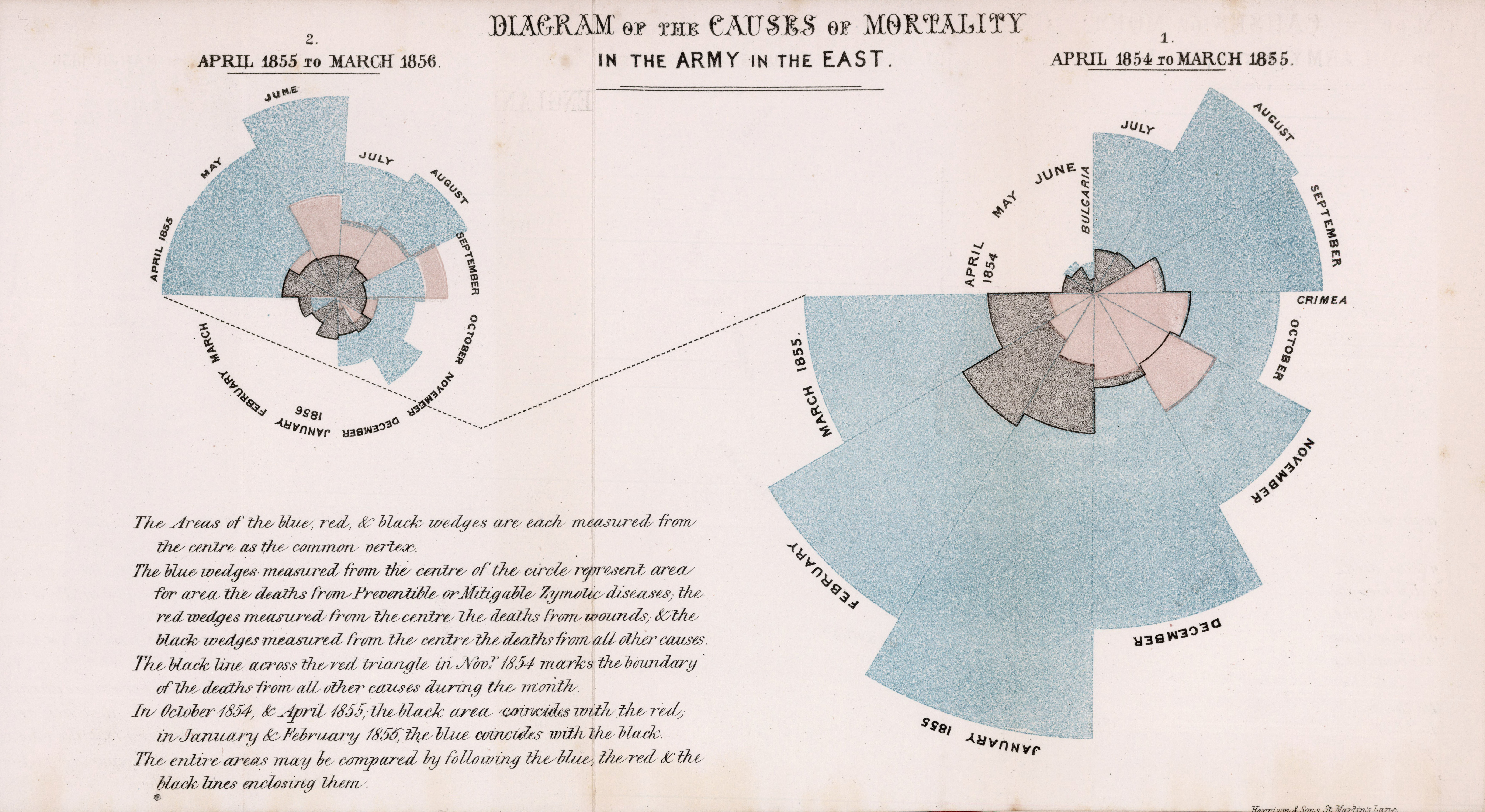
Florence Nightingales 1950s Coxcombe Diagram is a great example of how a chart has been used to inform. The visual highlighted that more soldiers were dying in the Crimean War from preventable infections and disease in military hospitals than on the battlefield itself. She used this visual to tell a story and used it to campaign for funding to improve the sanitary conditions in military hospitals – ultimately saving thousands of lives. Would showing the number of deaths in each military hospital on a map have added to this story or would it potentially have over complicated things, diluted the message and thus reduced the effectiveness of communication of the message of the data?
Another nice example of the use of charts and graphs to visualise data are those of W.E.B. Du Bois who published a series of charts, graphs and maps for the 1900 Paris world fair. The visualisations were designed to showcase the educational, social and business accomplishments of black Americans in the 35 years since slavery had officially been abolished. Whether they actually show progress is debatable but they’re beautiful and innovative visualisations, making the user want to engage with them.
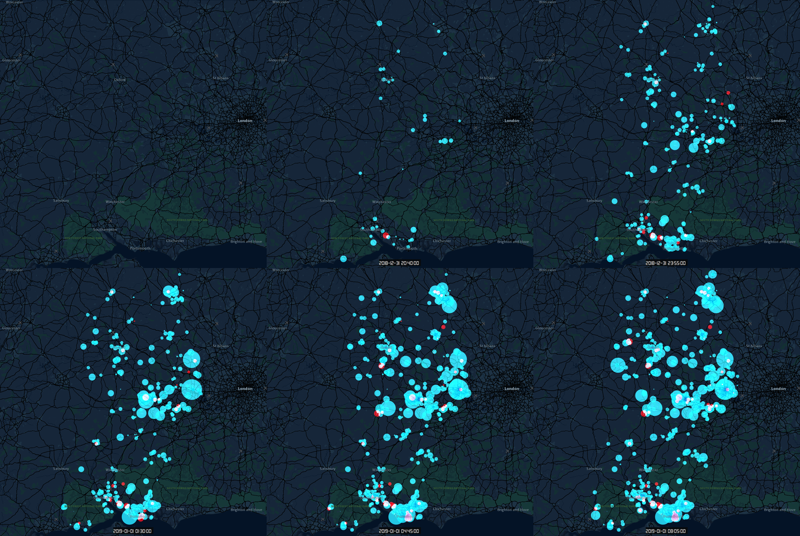
Animations are a great way to bring data to life and are more immersive and engaging as a method of communication than a simple static map or image. Animations are particularly effective if there is a temporal element to your data, showing the movement of something over time or changes to a dataset over time. Animations can help to identify patterns and trends which occur over time, which might not be immediately obvious from a static map. Animations could also be used to show how different datasets or layers fit together, giving the viewer a heightened understanding of your data.
Built on the idea of maps being a great way to communicate data of a spatial nature, storymaps take this one step further – they tell stories using a map or series of maps. Often these are presented as a web-based, dynamic, scrollable story, which combine descriptive text with maps (static or interactive) and other content such as images, videos and charts, to tell the story of the data. Storymaps are becoming a more and more popular way to immerse users in the story of the data, leading to better engagement with the content and effective communication of the message to the user. By including interactive maps within the storymap, users can be encouraged to explore the data in more detail.
Storymaps can be used to simply inform but can also be used effectively to engage the public or stakeholders in matters of a geospatial nature, allowing users to explore and understand the data. Storymaps are now commonly used to inform on policy, helping decision makers make better and more informed decisions. We think storymaps are a great way of telling the story of data to a non-technical audience.
Dashboards combine various types of data visualisations (on a single or related topic) in a single, easy to digest, view and can be tailored for a technical or non-technical audience. They commonly include graphs, charts, tables and statistics/metrics but can also include maps. A big benefit of dashboards is that they can be connected to multiple data sources and live data feeds, allowing changes in the data or status of something to be viewed in real-time.
Dashboards, like storymaps, can be used to provide information only (non-interactive) or can be interactive, allowing users to explore the data in more detail. They can be effectively used to tell a story with data and can reveal patterns, trends and relationships which ultimately help people understand the data and make better decisions.
A great example of the use of a dashboard is the one developed by John Hopkins University in response to the global Coronovirus Pandemic: COVID-19 Map - Johns Hopkins Coronavirus Resource Center (jhu.edu)
Infographics are a great way to present complex data in an easy to digest and visually appealing manner. Like a dashboard, they present a summary of a topic using several data visualisation techniques. They commonly include stylised icons, illustrations, statistics/metrics, charts, graphs and diagrams with short explanatory text. If presenting on spatial data, often a map will form part of the infographic. Although generally static, digital infographics sometimes include animations or short video clips.
Infographics are a great way to present a summary of data and findings to a non-technical or an audience with a time constraint, communicating clearly and quickly the key take-homes and attributes of your data.
This example from The World Bank shows how much our production of energy relies on water. Its a beautiful and well designed graphic that has a clear narrative and visual identity.